07/25/2024: Main Menu Concept Art
This week in Castle Fractal development was UI concept art, and getting those visuals into Unity. And I'm just going to get right to it: emotionally, seeing this in game makes the game feel... real.
I've been working on this game since October 2021. In the time since I've started this game, I've graduated high school and have made it halfway through my undergraduate career. And throughout it all, Castle Fractal has been growing. I've been growing as a designer. I was looking back at my Unity Learning Log, and saw that I had written in my Unit 5 notes of the Create With Code - Unity Learn section:
- Elements like title screens, menu buttons, text, score displays, etc. all fall into the category of User Interface (UI)–the user interacts with the UI during the game experience to get information about the game.
- A UI makes a game look much more professional and playable–something the player can experience from beginning to end without game-breaking bugs.
I had honestly forgotten I written that until today, but it's very much been influencing my feelings during development--things like Health Bars and the Inventory screen were some of the most exciting things to get working, not only because UI work is a brand new skill that I've had to learn (which is fun in its own way), but because it's when I spend the most time directly thinking about the player will interact with my game. And thinking about other people experiencing this game is downright thrilling!
I spent a lot of time thinking about menus from games that I've played, from Super Smash Bros. to Henry Stickmin to New Super Mario Bros. While I'm happy with how these turned out, I'm curious as to your thoughts on these menus; I'll be sharing around the concept art for these menus with people I know for more feedback to make sure that they're intuitive to use and pleasant to look at.
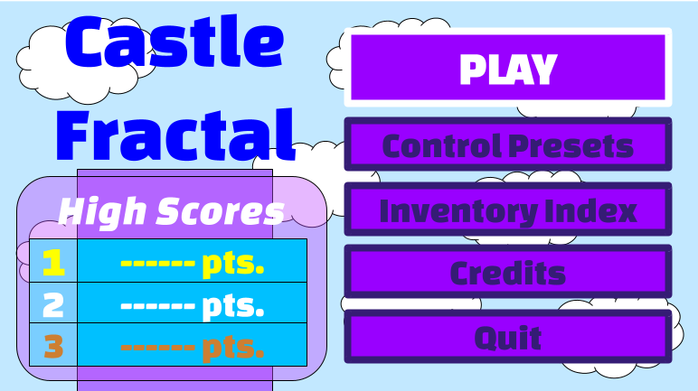
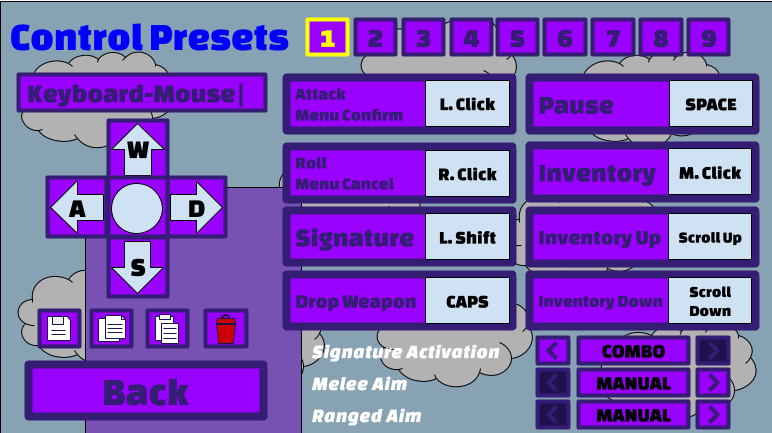
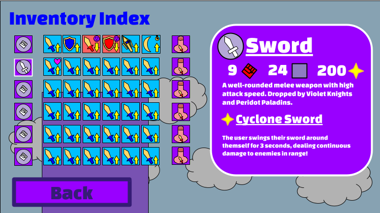
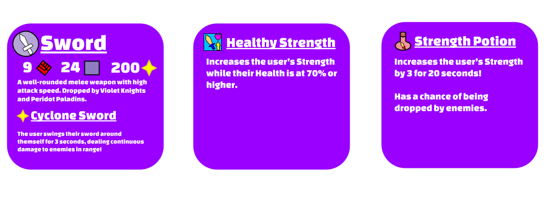
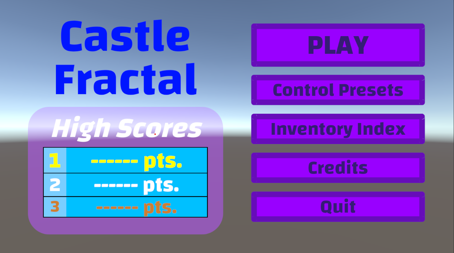
I'll talk about the implementation of these menus and menu navigation next week, as I work on them.
- I've implemented the visuals for the title screen and Credits.
- I'll first work on the Credits manual scrolling
- Then, I'll program the Inventory Index, and the icons showing.
- After that, I'll program the Control Preset settings.
- Finally, I'll program navigating between menus.
How much of this can I do in a week? Join me next week as I find out!
Get Castle Fractal: Combat Prototype 02
Castle Fractal: Combat Prototype 02
The second public prototype for my upcoming action game.
| Status | Prototype |
| Author | Hatfelt Prototypes |
| Genre | Action |
| Tags | Fantasy, Top-Down |
More posts
- 10/21/2024: Castle Fractal v0.9b Coming Next Month!Oct 21, 2024
- 08/08/2024: Main Menu ImplementationAug 09, 2024
- 07/18/2024: UI and Game InformationJul 19, 2024
- 06/26/2024: Rank Up SystemJun 26, 2024
- 06/19/24: Random Generation- Algorithm DesignJun 19, 2024
- 06/12/2024: Random Room Generation- Problem RepresentationJun 14, 2024
- 06/05/2024: Melee and Ranged Auto-AimingJun 06, 2024
- 05/29/24: Multiple Control SchemesMay 29, 2024
Leave a comment
Log in with itch.io to leave a comment.